
Summary
- A Shewhart chart tracks variation in processes over time, helping you to understand the variation and take appropriate action. A groundbreaking tool a century ago, it remains just as useful today, and it’s essential to any improvement journey.
On May 19, 1924, at the Western Electric factory in Cicero, Illinois, Dr. Walter Shewhart wrote a memo to his manager introducing a tool he had been developing. This tool, Shewhart wrote, is designed “to give at a glance the greatest amount of accurate information to help the inspectors determine if there was a problem with the process producing their equipment.” Why, you might ask, should I care about a tool invented 100 years ago to improve the manufacture of telephones? Let us provide a little background.
When we teach improvement science courses, a key message in all of our programs is to understand the variation that lives in the process you plan to improve. We challenge participants to name something that doesn’t vary. And, of course, they can’t. All systems will show variation. Any time you take two measurements, the two resulting data points will almost certainly be different. If the data is quantitative, one data point will most likely be higher than the other. How do you know, then, what to do about this difference?
This is where the work of Dr. Shewhart comes into the picture. The Shewhart chart (also called a statistical process control chart, or just a control chart) is an ingenious tool for answering two questions related to improvement: 1) How do our processes vary over time? and 2) Are our processes under current operating conditions capable of meeting the needs of those we serve? The elements of a Shewhart chart (Figure 1) consist of:
- Data plotted over time (e.g., by day, week or month)
- A centerline plotted through the data (usually the mean)
- Upper and lower “control limits,” called sigma limits, derived from mathematical formulae that capture the variation within and between the plotted data points. The statistical limits are derived from the underlying assumptions about the type of data being collected.
For those of you who have taken even a basic course in quality measurement, these terms will sound familiar. But if you are new to the field of quality measurement, these terms and expressions may seem a little foreign. No worries. Our purpose in this brief overview is not to give you deep insight into how to construct a Shewhart chart (luckily, there is good software for that) but to share why you should make these charts an essential component of your quality measurement journey. We have provided references at the end of this article for those who want to learn more about the design and use of Shewhart charts.
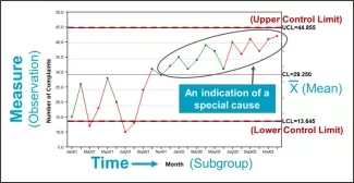
Figure 1. Elements of a Shewhart Chart
Source: Lloyd R. Quality Health Care: A Guide to Developing and Using Indicators (2nd edition). Jones and Bartlett Learning; 2019:207. Used with permission.
A Shewhart chart is essentially an operational definition of the variation that lives in a process. The chart allows us to decide if the variation in a process is due to normal or random variation caused by factors inherent in the process (i.e., common-cause variation) or factors that are different from the regular functioning of the process (i.e., special-cause variation). Also note that common-cause variation is not necessarily “good” variation, nor is special-cause variation necessarily “bad.” A process can be stable and predictable, but the results may be unacceptable. For example, if your average morning commute takes about 76 minutes, with the maximum commute at 88 minutes and the minimum commute at 64 minutes, this might be a stable and predictable process, but you may find it unacceptable. On the other hand, if you changed your morning routine (e.g., by leaving earlier or taking a different route), you may observe a downward trend in your commute time, which would be an acceptable special cause.
The point is that variation exists. The Shewhart chart allows you to understand the variation in a process and then take the appropriate action. If the process shows only common-cause variation, and we don’t like the results, we must change the process. No amount of exhortation to “work harder” or “do better” will produce a sustainable improvement in the outcome. If, on the other hand, we detect signals of special-cause variation, we should investigate them to determine why they have occurred and then take steps to remove the factor(s) in the process that produced the special cause(s). Special causes provide an opportunity to learn from the variation in our processes. Making the wrong decision about variation wastes time and money and contributes to low morale in the workforce. Furthermore, blaming or rewarding people for variation over which they have little to no control is inherently demotivating.
Learn how you can effectively use data for improvement with IHI's Better Quality Through Better Measurement
As we teach improvement programs around the world, we have seen the lightbulb go off above many heads when people realize the power of understanding variation conceptually and statistically. A lightbulb moment is realizing that we could stop chasing after aggregated data (e.g., average length of stay or average wait time to see the doctor). We could stop rewarding or blaming people for the high and low patient satisfaction results. Instead, we could focus on understanding the structures, processes, and cultures that are the sources of variation in the data. Then we can decide if we need to reduce variation but retain the current process or fundamentally redesign the process because it is not capable of achieving the results we seek.
Time after time, as participants realize that they can move from using bar charts, pie charts and red/yellow/green (RYG) reports to evaluate process performance and start, instead, to plot that data over time, they see their processes in a totally different light. And when they see the system, they see that the outcomes are caused, primarily, by the system itself and its related processes, not the people working in it.
A common question people ask when learning how to support improvement teams is, “How can I motivate or engage the team in this work?” We typically respond that helping teams use data for improvement, not using it for judgment, is a key to engaging people in improvement. But to do this, the data need to be collected as close to the production of work as possible (i.e., by hour, day week or month). This allows us to understand the variation in the process over time, not in the aggregate. Hopefully this overview helps you see that the Shewhart chart can play an essential role in your quality measurement journey. And it all started 100 years ago.
References
- Carey RG, Lloyd RC. Measuring Quality Improvement in Healthcare: A Guide to Statistical Process Control Applications. Milwaukee, Wisconsin: Quality Press; 2001.
- Lloyd R. Quality Health Care: A Guide to Developing and Using Indicators (2nd edition). Burlington, Massachusetts: Jones & Bartlett Learning; 2019.
- Mohammed MA, Worthington P, Woodall WH. Plotting basic control charts: Tutorial notes for healthcare practitioners. Quality and Safety in Health Care. 2008 Apr:17(2):137-145.
- Provost LP, Murray SK. The Health Care Data Guide: Learning from Data for Improvement, (2nd edition). San Francisco, California: Jossey-Bass; 2022.
- Wheeler DJ, Chambers DS. Understanding Statistical Process Control. Knoxville, TN: SPC Press; 1992.
Rebecca Steinfield is an IHI Senior Project Director, Innovation and Design, and Robert Lloyd is an IHI Senior Advisor, Improvement Science and Methods.
Photo source: iSixSigma
You might also be interested in:
Avoid Two Common Mistakes with a Shewhart Chart
Video: Whiteboard Control Charts 1
Video: Whiteboard Control Charts 2
IHI Open School Course: Interpreting Data: Run Charts, Control Charts, and other Measurement Tools